Guardian by Nordgreen
The challenge for Nordgreen Copenhagen was to create a new brand identity for Nordgreen's flagship product. The solution is a lifestyle-centered brand universe around
The Guardian and use of storytelling to emotionally engage the audience and create a community around the brand.

The making of the logo
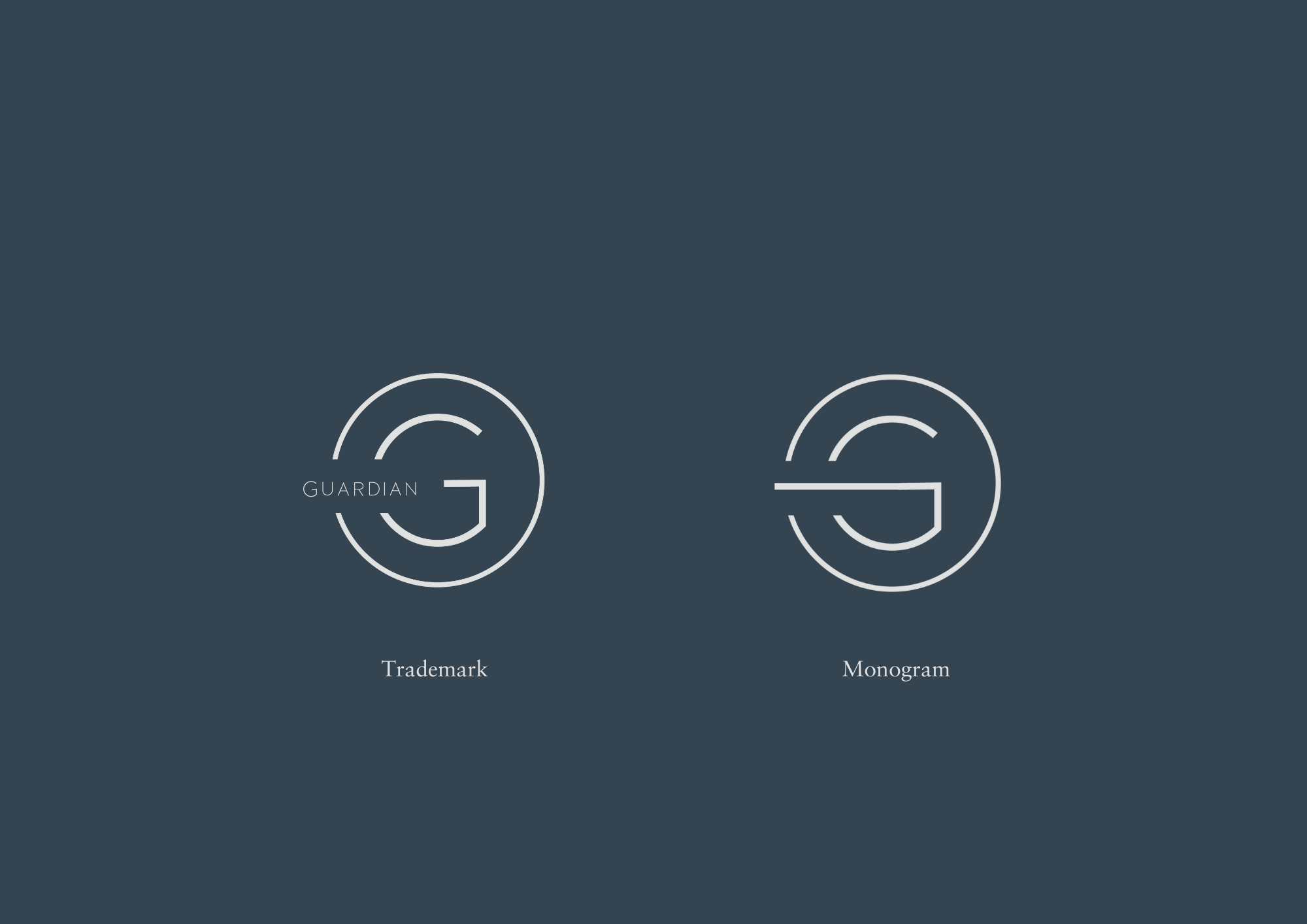
This is my suggestion for a logo design for the Guardian. I started my logo creation by looking at Nordgreen´s current logo and took inspiration from their recognizable ‘G’ and decided to open it as a reference to that logo.
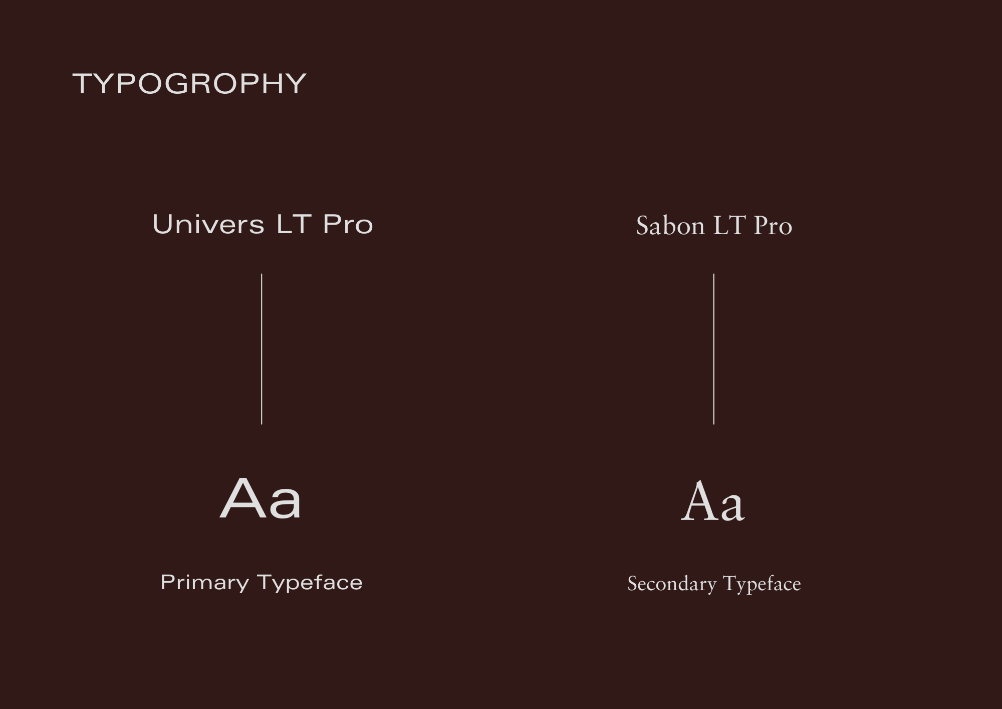
The customized Sans Serif font, Loves typeface gives it a contemporary and clean look, contrasting the more traditional and classic color palette. This contrast represents Guardian’s modern take on the classic Danish design.
Trademark & Monogram
The Monogram and Trademark were developed to replace the primary logo when needed, both on print as well as online. The trademark was created to be used on packaging and on social media when needed. While the monogram can be used in places where the sizing has to be smaller and the text won’t be visible.
On the Trademark I wanted to visualize a bridge between the brand and the community and therefore placed Guardians logo into the gap.
Colours
The colour palette was designed to be classic, genderless and distinctive.


